|
Before
returning to aircraft modelling in the last few years, I had been a long time
figure painter. It is perhaps for this reason that I enjoy tinkering with the
pilot figures often found in kits, although I generally don’t place pilots in
the cockpits as they hide much of the detail.
One
of the big problems with figure painting is that poor painting can ruin a
well-sculpted figure, but an exceptional paint job will not salvage a
poorly sculpted or cast figure. The reason behind this is painfully simple: We
all see the human figure daily and have done so for our entire life. This means
that we instantly recognise errors in anatomy, proportion, and pose, and a coat
of paint cannot disguise them.
As a consequence do not use
those figures that your brain tells you are somehow wrong. Also try to avoid
those where the detail is either heavy or indistinct. For injection moulded
figures in 1/48 this can be difficult because the figure is only some 35-40mm
high when standing. However several of the figures included with current kits
are of an acceptable standard, and can either be used as they are, or as the
basis for a little super detailing. For the purpose of this article I will use
two injection figures that I have in kits to hand.
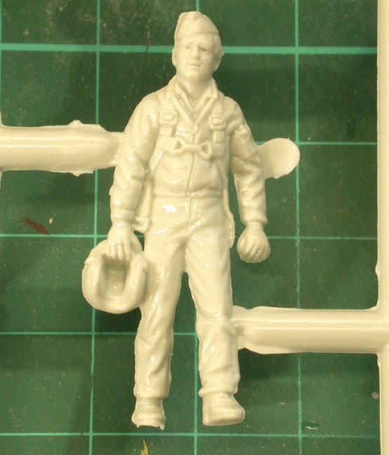
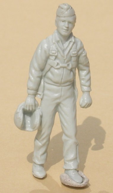
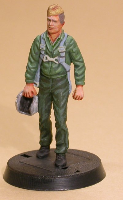
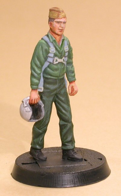
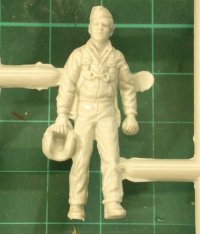
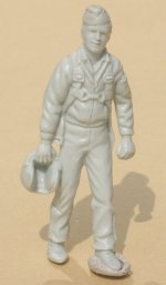
- The walking figure found in the Revell/Monogram F-5E kit. Despite the age of the
kit this is a surprisingly good figure, with a natural and interesting pose.
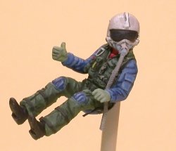
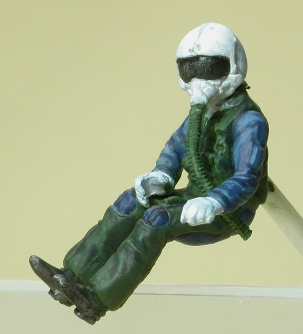
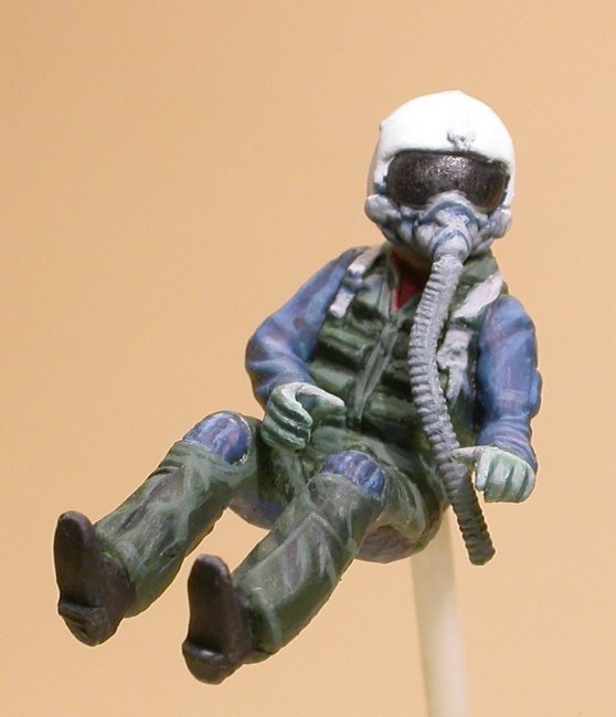
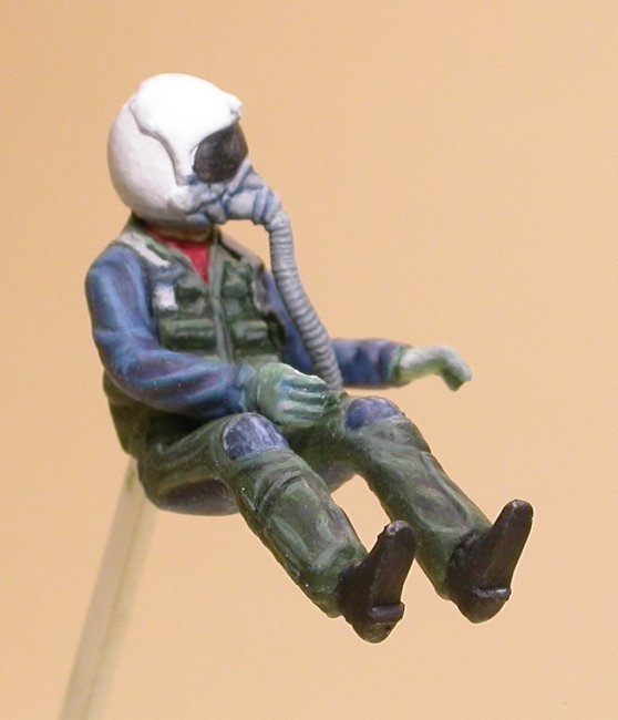
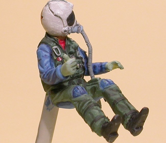
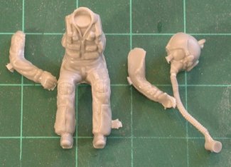
- The
seated pilot found in the Hasegawa F-18 Hornet kits. Each kit provides two
figures with separate arms, and usefully a separate head. The pose again
looks natural to my eye, and given the requirement of fitting in the kit
cockpit this figure is more than acceptable.
|
Click on
images below to see larger images
|
 |
|
| Monogram F-5E pilot |
Hasegawa
F-18A pilot |
|
The
walking figure could be regarded as a painters figure. A simple
straightforward pose with no real work needed on the figure before
painting starts. The only dodgy area is the back of the jacket, but this
can be left as is without it really detracting from the rest of the
figure. On the other hand the seated pilot can be significantly improved
before painting if desired. To illustrate the difference this can make I
will paint this figure twice, one straight out of the box, the other with
detail applied.
Preparation
All
these figures have a casting line around them, and this is most easily
removed with a sharp scalpel blade. To do this I drag the blade backwards
along the seam, and one or two passes will normally suffice. The
seam needs to be fully removed because, if not, in this scale it will be
very noticeable on the finished figure. Gentle sanding with a fine sanding
stick or paper completes the process.
At
this stage, to help with the later painting of the figure, I now gently
run the scalpel blade (again backwards) along all the edges of the figure.
By this I mean along the edges of straps, belts, pockets etc. This gives
slightly more depth to the figure when painted, and helps the straps and
the like have more defined edges. (This makes painting them a lot easier). |
Click on
image below to see larger image
|
|
|
Figure
scraped, awaiting primer
|
|
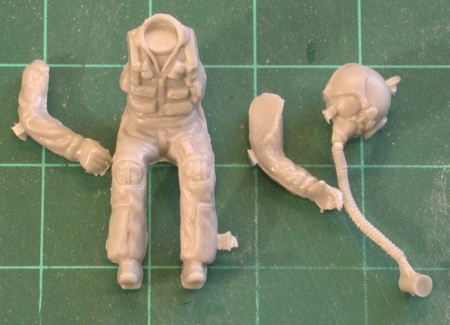
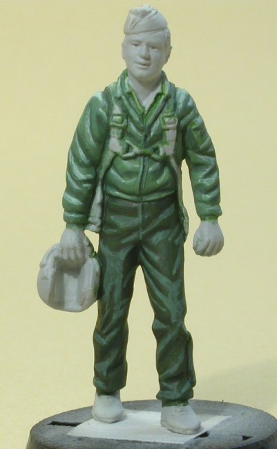
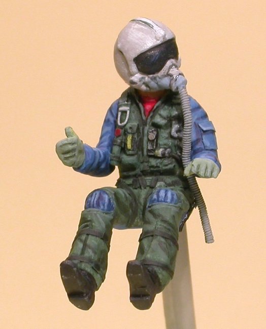
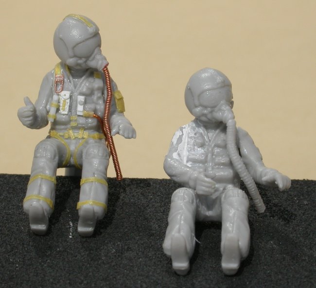
To
add detail to the seated figure I searched on the ‘net for some reference
photos, although the best I could find was a page sized photo of the Dragon F-18
pilot doll. This showed a profusion of straps and survival equipment not
included on the Hasegawa figure.
To
recreate these additional straps I used Tamiya masking tape cut to size. This is
easily applied and adjusted using a scalpel blade. In addition a torch was made
from plastic rod, a small vertical pocket on the chest was made from milliput
and what looks like some kind of audio switchbox, again on the chest, was made
from plastic card. The cable from this was made from copper wire. I also chose
to remove the plastic oxygen hose, and replace it with one made from wire
wrapped around wire (no seam to remove, and much finer detail).
Copper wire was also used to make the steel snaplink visible on the right
shoulder. The difference between this and the standard figure can be seen below.
(Note; the arms are positioned so as not to obscure the figure, rather than a
correct pose)
|
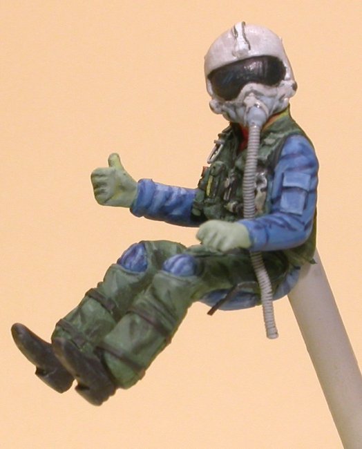
|
|
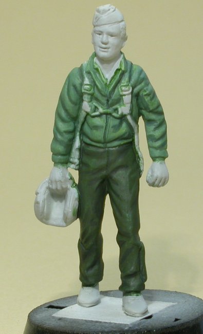
Detailed
vs. OOB |
To
start painting a quick undercoat is applied using the airbrush. This only wants
to be a thin coat so that no detail is lost.
|
|
|
Primed
F-18 figure (boy, does enlarging the photo show the flaws) |
Painting
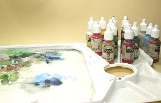
All
three figures were painted using Vallejo Model Color acrylic paints (not the Air
Color range), applied with a fine paintbrush and mixed on a “stay wet”
palette. Due to the fragile nature of acrylic paints I often paint figures with
a base coat of enamels, seeking to find a colour that is a close match to that
of the final coat. Once the base colours are dry the real painting can begin.
There are probably as many ways of painting a figure with acrylics as there are
painters, and I make no claim that mine is the best, however it works for me.
When
using Vallejo acrylics it is very important the give the bottle a good
shake before use. Failure to do so will result in a gloss finish once the
paint dries, which is in contrast to the otherwise excellent matt finish
that well mixed paint will produce. All three figures were painted with a
Size 1 brush (Windsor & Newton Series 7), which shows that a quality
paintbrush and the correct consistency paint are the secret to good paint
control.
|
For
figures in this scale I will add a little water to the paint seeking to
obtain a thick but free flowing mix. (I can’t really explain this
better, and all I can suggest is plenty of experimentation). The
consistency of mix I work with is such that each colour is totally opaque,
and this means one stroke only is needed to lay an overlying colour down.
Control of the paint is essential and the consistency of the paint
determines this.
This
method differs a from the more mainstream process used by figure painters
on larger scale figures, which involves applying many coats of very thin
paint over a base colour, with each coat being slightly different in
colour from the next. This method is too much effort for no real gain in
1/48 scale, but I will cover it in more detail in a follow up article
“Painting a 1/32 Pilot”. |
Click on
image below to see larger image
|
 |
|
Paints
and Stay Wet Palette
|
|
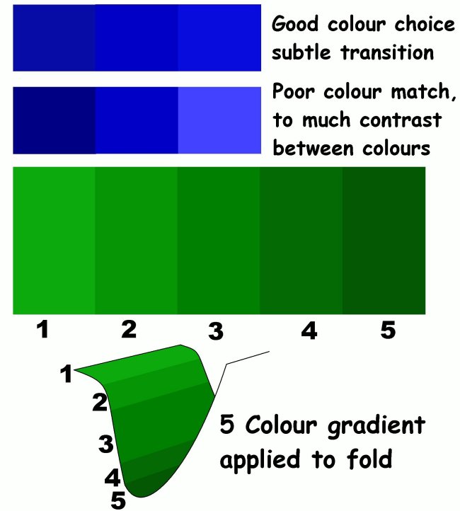
The
basic principle followed by all figure painters is to create a range of shades
for each base colour. This allows lighter shades or highlights to be painted in
those areas that catch the light (i.e. the top of the arm), and darker shades or
shadows in the areas hidden from the light (i.e. the underside of the arm and
armpit). This range of colour gives a sense of depth to the figure that fools
the eye and makes the figure appear more realistic and natural. (Due to the
small scale of the figures natural light alone will not do this). This is why a
figure (or any object) that is painted with just one shade of each colour
required will look flat and lifeless, despite the fact that painting
instructions may have been followed to the letter.
For
1/48 scale figures it is acceptable to work with as few as three shades: base,
highlight, and shadow. These can be added to as painting progresses if required.
(Larger figures will require a greater range of shades). Having said this I
generally lay down a dark and light tone, and then repeat the process with
different dark and light tones, which means I lay done five shades in total.
The
easiest way to create three shades is to mix a large pool of the base colour,
and from this separate out two further pools. To these further colours are added
to create the lighter and darker versions. When creating these shades of the
same colour it is vital to ensure that each shade is sufficiently different from
the colour it will be placed next to, without being so different so as to look
wrong. At this point paint can now
be put on the figure. Some painters
work dark to light, however I apply the base colour first then add the shadow,
and lastly the highlight.
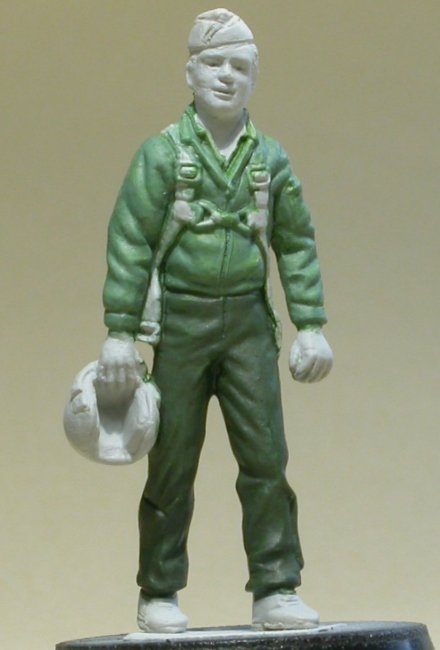
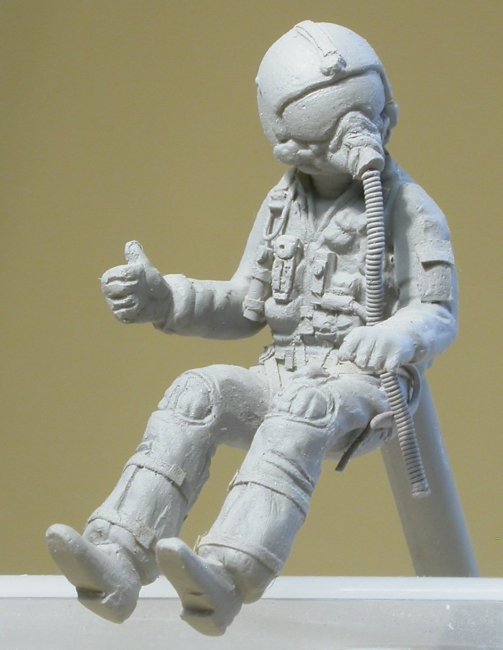
On
the F-5E pilot I have deliberately exaggerated the shadow and highlight to
ensure that they can be seen in the photos. To tone this back down a highly
thinned wash was painted over the trousers and jacket. This wash blends the
base, shadow and highlights together and is a useful trick to use if the
contrast created is too great.
As
an example when painting a jacket the process can be as simple as
-
Lay down the correct base colour, and allow to
dry
-
Create from the base colour a highlight and
shadow colour.
-
Carefully paint in the shadows, using raised
folds, edges, etc as your guide
-
Paint in the highlights
-
Touch up any sloppy paintwork
If
using more than 3 shades you also need to narrow the width of each brush stroke
as you approach each end of the colour range. In other words the brightest
highlight, and darkest shadow are normally the thinnest brushstrokes applied.
This helps to create a graduated effect through the colour from light to dark.
When painting with acrylics the edge between two shades of colour is not
blended, rather the closeness of colour match fools the eye into seeing a
graduation across the colour range. The more shades of colour used the subtler
the effect that is created. Again I
cannot stress the importance of colour selection within the process to ensure
that the eye is fooled.
|
Every
High has a Low
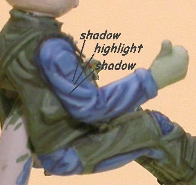
The
secret to painting light and shade is to understand the connection between
the two. A shape that creates a shadow will also have a part that catches
the light, and so one cannot be painted without the other. When looking at
a figure to judge what areas are in shadow and what areas create a shadow
imagine a light source directly above the figure. This will mean all upper
surfaces catch (and reflect) light and so need to be highlighted, while
all lower surfaces will be in shade, and need to be darkened.
|
Click on
image below to see larger image
|
 |
|
Highs
and Lows
|
|
So
every highlight has a shadow and vice versa. The eye expects to see this, so
make sure you painting reflects’ it. When painting these highlights and
shadows ensure your brush strokes are controlled and in the right place.
Another
trick when painting figures in this scale is to exaggerate the contrast between
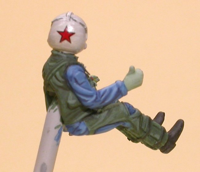
similar colours, or select differing colours. An example of this is the blue
flight suits of the two F-18 pilots. Blue was chosen not only because Top Gun
crews wear them, but also because it prevents the figures from being green all
over. (Green flight suit, G-suit and combat vest). For the same reason the
jacket colour of the F-5E pilot is a different green from the trousers. As a
consequence the figures are more interesting to the eye..
Where
I wish to hint at a gloss or shiny surface I carefully paint the appropriate
area with a light coat of Future. This produces, in this scale, a satin effect.
I have done this on all three helmets, as well as the visors on the seated
figures.
Painting
Flesh
I
mix my own flesh, using a mixture of white, red and yellow, together with a
touch of brown to give colour. This is good practice and helps allow me find the
light and shade tones. Due to the large amount of white in flesh you cannot
darken it by adding black rather you must make a mix using less white.
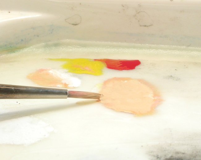 |
|
Flesh
mix light tone |
I
tend to make the light tone first and undercoat all the flesh areas of the
figure. While this is drying I then add further red, yellow and if necessary
more brown to create the darker tone. This is then carefully painted around the
hairline, under the chin, cheekbones and other areas where appropriate. When
painting a face in this scale there is no need to try and recreate the detail of
eyes, mouth etc, rather you only need to hint at it. Look at a real person at a
distance of 20 feet as that equates to a 30mm figure held about 5 inches from
the eye, and see how much detail you can see.
The
detail that is needed is best added by using the light and shade tones.
Underline with the shade tone the mouth to give it definition, while applying
the highlight tone (this may be almost pure white) to the bridge of the nose
etc. These and the other contrasts on the face will give it depth and provide
enough detail for the brain to feel in the gaps. (In other words you again fool
the eye). I’ll cover the painting of faces in more detail in the article on
painting a 1/32 pilot.
Washes
Washes
are easy to do when using acrylics due to the high level to which they can be
thinned. They are best used to bring out scribed or recessed detail, as the
thinned colour will run into recesses and remain there. For this reason most
washes either add to the shade tones, or are used to provide a contrast to a
lighter colour and so reveal detail. The two oxygen hoses received washes to
allow the ribbing detail to be seen. A wash will not change the level of detail,
but you can see the difference between the kit hose and the wire one.
As
mentioned earlier an overall wash can also be used to blend colours together.
Not only was this done on the F-5E figure, but also on both helmets for the
seated figures to create a subtler effect after the detail of each had been
outlined (see below).
Outlining
This
technique also allows detail to be more easily seen, in this case by simply
painting a darker outline around all or some of the features of the figure.
The seated figures have had the details of the oxygen masks and helmets
outlined, so bringing out the detail of the various straps etc. Choice of which
colour to outline with is important, and I would suggest black never be used,
rather a darker tone of the base colour.
…and
finally
While
the F-5E figure paints up nicely with just simple preparation, I think it is
fair to say that the additional work on the detailed F-18 pilot makes a
significant improvement over the OOB figure.
We see daily here on ARC finished models of the highest quality, often
incorporating expensive aftermarket items, be it resin cockpits, photo etch
frets, or decals all adding to the quality of the overall build.
So
don’t sell yourself short, a little work (and practice) on a pilot figure will
also pay great dividends.
PAINT
!
One
of the comments you frequently read on the various internet forums and websites,
be it aircraft, figures, armour or whatever, is
“what
colour best matches ……”
The
suggestion being that every colour we use, must come straight out of the bottle
or tin!
Paint
is just another tool in our armoury and we can use it any way we like to gain
best effect. As a modeller be prepared to mix colours and experiment with paint.
These
are the paints I have to hand
-
20 or so tubes of artist’s oil paints (mainly
Windsor and Newton)
-
16 bottles of Vallejo Model Colour
-
various tubes of Rowney acrylic paints
-
a smattering of old Citadel paints and inks
-
a drawer full of Humbrol and ExtraColour
enamels
-
a box full of PollyScale, Aeromaster and Tamiya
acrylics.
I
will use any of the above in a project if I think I will gain the best result as
a consequence, and often I will experiment on scrap first to test my thinking.
If
for no other reason, it is worth having a go at painting figures, as it will
make you more confident in mixing colours and gain a better understanding of how
you can make paint work for you.
Pete Wenman
|
|