|
When
your carefully researched and meticulously applied SE Asian three-tone color
scheme dried did it look two-toned? GROAN!!!
What happened!!?? You
re-check the colors; yes, that's right. What
is going on? I'll bet you didn't
apply "scale color". What
is scale color? Look a little
closer, closer than that. Put your
nose on it! Ah, see, there are
three colors. But, when you view
the model standing-up, it's just brown and green.
When
white light is reflected off an object, it absorbs a portion of the color
spectrum; the light that is not absorped is what the eye sees as an object’s
color. As the distance between an
object and the viewer increases, more of the reflected light dissipates and the
lighter that color will appear. In
other words, the further away an object, the lighter it appears. Regardless of its color, all objects fade to gray as they
approach infinity. The brightness
of light, air quality, type of light source and many other factors influence
this phenomenon. Your brain will
interpret the distinctions between close colors to be similar in appearance at a
very short distance; close colors look the same with distance.
On a scale model you are, essentially, forcing the viewers' perspective. When
viewers stand 12 inches from a 1/48-scale model, they see a view of the real
thing from 48 feet away. This
forced perspective and the fading with distance means your brain expects similar
colors will lose their distinction very quickly.
| What
your brain will notice on your model is contrast.
This is the key to scale color. In
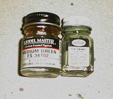
their literature, Testors Corporation gives percentages of white to add to their
paint line to compensate for scale. My
experience with adding white to paint is a very faded bleached look.
When I have two shades of a color that are close together, I tint the
lighter color with an even lighter or brighter shade of that color.
In our example above, I tinted the lighter green paint with a very light
shade of green.
|
|
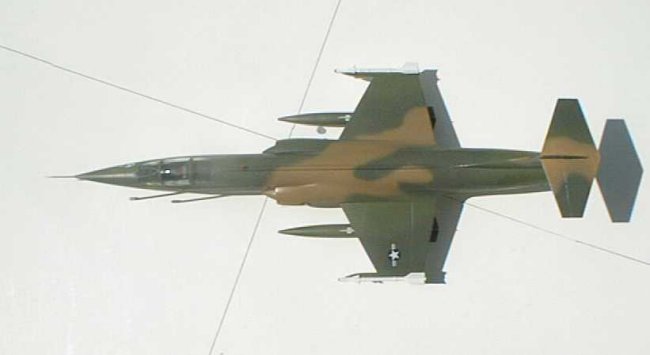
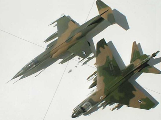
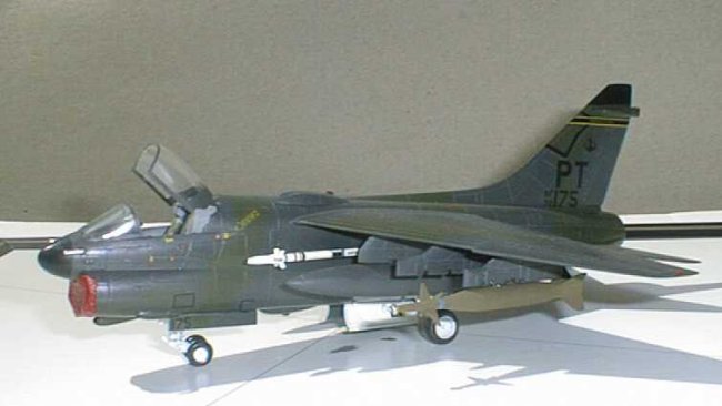
Now
one color of this paint scheme is not an exact match, but you will now see the
contrast between the greens just like in your reference photo. These two models
are painted with exact same colors except for the med green on the A-7!
Look at the A-7D. In this picture the dark green looks almost black. But,
it is right out of the bottle just like on the F-104! The F-104 looks 2-tone
while the A-7 shows 3 distinct colors. If
it looks right, it is right.
I
do not, as a rule, try to make every shade appear in scale.
I look for the colors that are very close together then lighten and
brighten the lighter shade. I apply
the colors I'm concerned about on my scrap model for a comparison. Generally, just tinting one color will be sufficient.
Now, theoretically, you could darken the darker color and increase the
contrast. My experience with this approach has not been good. Generally, when I
darken an already dark color, it turns to something like black pretty quick.
When mixing paints be sure to test for compatibility. Generally, stay with same paint line for mixing and matching
or test your concoctions on scrap. If
the model color scheme calls for paints that have good color contrast or the
real thing shows no contrast I just paint the colors on and don't worry about
this stuff.
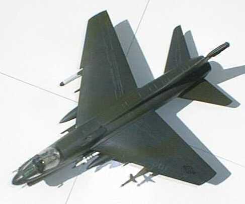
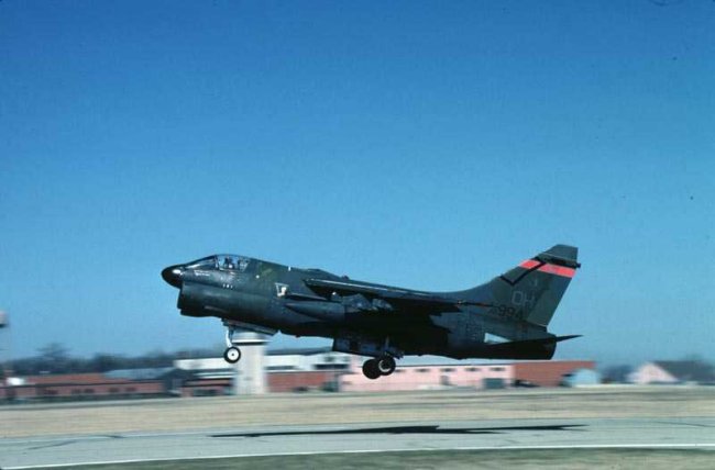
In
the 80s, the USAF applied a European scheme that was very dark.
When I applied this scheme to an A-7, across the room, it looked close to
black. When I saw the real thing on
a cloudy day across the tarmac at an air show, it looked close to black.
You couldn't see the individual colors until you got closer. Compare the
model pictures below to the real thing. (same model different light.)
Yup!
I stumbled onto the truth. So,
this is not something that you will have to consider for every model.
But now when your masterpiece has all the right colors and still doesn't
look right, you know why and how to fix it!
Richard J. Tucker
|
|